How to build a nice Hamburger Button transition in Swift
Hamburger buttons may have become somewhat of a cliché in interface design lately, but when I came across a particularly nice transition of a hamburger button on dribbble, I had to try and recreate it in code.
Here's the original shot by the CreativeDash team:
You'll notice how the top and bottom strokes of the hamburger form a X, while
the middle one morphs into an outline. I knew this effect could be recreated
using CAShapeLayer, but first I had to create a CGPath for each of the three
strokes.
The short, straight strokes can be figured out manually:
let shortStroke: CGPath = {
    let path = CGPathCreateMutable()
    CGPathMoveToPoint(path, nil, 2, 2)
    CGPathAddLineToPoint(path, nil, 28, 2)

    return path
}()
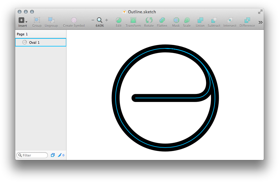
For the middle stroke however, I created a path in Sketch that starts from the middle and seamlessly transitions into the outline.

I then exported this path as an SVG file and imported it into the old
PaintCode 1, which converted the file into a code snippet that created a
UIBezierPath. I then rewrote said piece of code into the following
instructions that create the desired CGPath object:
let outline: CGPath = {
    let path = CGPathCreateMutable()
    CGPathMoveToPoint(path, nil, 10, 27)
    CGPathAddCurveToPoint(path, nil, 12.00, 27.00, 28.02, 27.00, 40, 27)
    CGPathAddCurveToPoint(path, nil, 55.92, 27.00, 50.47,  2.00, 27,  2)
    CGPathAddCurveToPoint(path, nil, 13.16,  2.00,  2.00, 13.16,  2, 27)
    CGPathAddCurveToPoint(path, nil,  2.00, 40.84, 13.16, 52.00, 27, 52)
    CGPathAddCurveToPoint(path, nil, 40.84, 52.00, 52.00, 40.84, 52, 27)
    CGPathAddCurveToPoint(path, nil, 52.00, 13.16, 42.39,  2.00, 27,  2)
    CGPathAddCurveToPoint(path, nil, 13.16,  2.00,  2.00, 13.16,  2, 27)

    return path
}()
There probably is a library that allows you to load CGPaths straight from SVG
files, but for a short path like this one, having it in code is not a big deal.
In my UIButton subclass, I added three CAShapeLayer properties and set the
their paths accordingly:
self.top.path = shortStroke
self.middle.path = outline
self.bottom.path = shortStroke
Then I styled all three of them like so:
layer.fillColor = nil
layer.strokeColor = UIColor.whiteColor().CGColor
layer.lineWidth = 4
layer.miterLimit = 4
layer.lineCap = kCALineCapRound
layer.masksToBounds = true
In order to calculate their bounds correctly, I needed take the size of the
stroke into account. Thankfully, CGPathCreateCopyByStrokingPath will create a
path that follows the outlines of the original stroke, therefore its bounding
box will then fully contain the contents of the CAShapeLayer:
let boundingPath = CGPathCreateCopyByStrokingPath(layer.path, nil, 4, kCGLineCapRound, kCGLineJoinMiter, 4)

layer.bounds = CGPathGetPathBoundingBox(boundingPath)
Since the outer strokes will later rotate around their right-most point, I had
to set their anchorPoint accordingly when layouting their layers:
self.top.anchorPoint = CGPointMake(28.0 / 30.0, 0.5)
self.top.position = CGPointMake(40, 18)

self.middle.position = CGPointMake(27, 27)
self.middle.strokeStart = hamburgerStrokeStart
self.middle.strokeEnd = hamburgerStrokeEnd

self.bottom.anchorPoint = CGPointMake(28.0 / 30.0, 0.5)
self.bottom.position = CGPointMake(40, 36)
Now, when the button changes state, it should animate the three strokes to their new positions. Once again, the two outer strokes are easy. For the top stroke, I first moved it inward by 4 points to keep in centered, then rotated it by negative 45 degrees to form one half of the X:
var transform = CATransform3DIdentity
transform = CATransform3DTranslate(transform, -4, 0, 0)
transform = CATransform3DRotate(transform, -M_PI_4, 0, 0, 1)

let animation = CABasicAnimation(keyPath: "transform")
animation.fromValue = NSValue(CATransform3D: CATransform3DIdentity)
animation.toValue = NSValue(CATransform3D: transform)
animation.timingFunction = CAMediaTimingFunction(controlPoints: 0.25, -0.8, 0.75, 1.85)
animation.beginTime = CACurrentMediaTime() + 0.25

self.top.addAnimation(animation, forKey: "transform")
self.top.transform = transform
(The bottom stroke is left as an exercise to the reader.)
Again, the middle stroke is a little trickier. In order to achieve the desired
effect, I needed to animate the CAShapeLayer's strokeStart and strokeEnd
properties separately.
First I had to figure out the correct values for the two properties in the two states. Note that the even in its hamburger state, the stroke does not start at 0. By having the path extend slightly beyond the left edge of the outer strokes, we can achieve a nice anticipation effect when applying the timing function later:
let menuStrokeStart: CGFloat = 0.325
let menuStrokeEnd: CGFloat = 0.9

let hamburgerStrokeStart: CGFloat = 0.028
let hamburgerStrokeEnd: CGFloat = 0.111
Now we only need to create the animations and add them to the layer:
let strokeStart = CABasicAnimation(keyPath: "strokeStart")
strokeStart.fromValue = hamburgerStrokeStart
strokeStart.toValue = menuStrokeStart
strokeStart.duration = 0.5
strokeStart.timingFunction = CAMediaTimingFunction(controlPoints: 0.25, -0.4, 0.5, 1)

self.middle.addAnimation(strokeStart, forKey: "strokeStart")
self.middle.strokeStart = menuStrokeStart

let strokeEnd = CABasicAnimation(keyPath: "strokeEnd")
strokeEnd.fromValue = hamburgerStrokeEnd
strokeEnd.toValue = menuStrokeEnd
strokeEnd.duration = 0.6
strokeEnd.timingFunction = CAMediaTimingFunction(controlPoints: 0.25, -0.4, 0.5, 1)

self.middle.addAnimation(strokeEnd, forKey: "strokeEnd")
self.middle.strokeEnd = menuStrokeEnd
Putting everything together, the result looks something like this:

I'm pretty happy with how it turned out. If you are too, you can find the code on GitHub and follow me on Twitter.
Posted in working-on