Mobile sites, at rest
Today, I read a tweet by Jens about how he switched to the SoundCloud mobile site on the desktop.
I can certainly see why you would do that, mobile sites are more to the point and optimized for slow connections, which makes them super fast when you're wired.
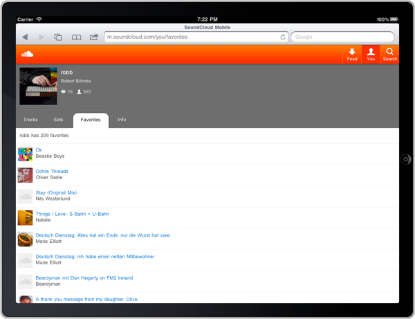
Yet, I wondered how well it would work. I’ve been using the site on my iPad but it certainly is not optimized for that screen size - especially in landscape.

Just pointing any modern browser to http://m.soundcloud.com
will do the trick, but switching between tabs just to play another track is a hassle,
So is accidentally closing a tab.
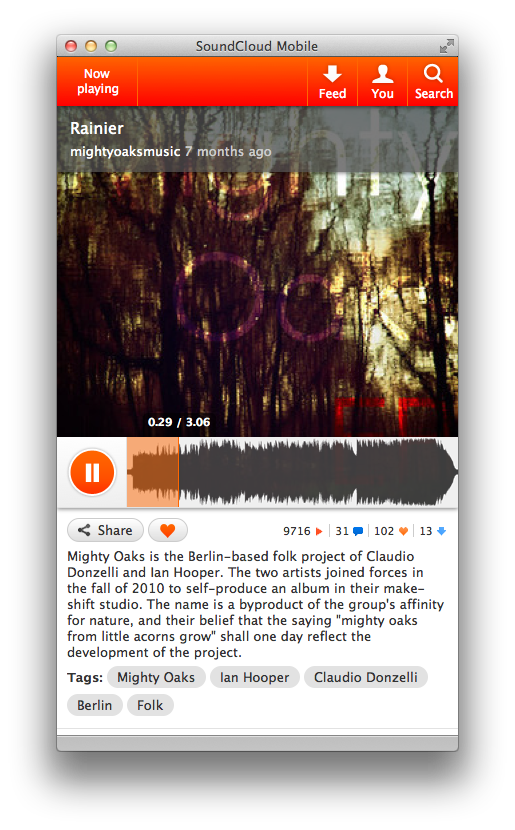
Luckily for us, there is a tool that allows you to create single site browsers.
It's called Fluid.
Just enter a name, the URL and where it should get the icon from and presto, you got yourself a nice little app.

Now, this is cool and all, but I really urge you to go the extra mile. Turns out, if you spend $5 on Fluid's pro version you'll get the warm feeling of supporting small developers as well as access to a feature called Pin to status bar.
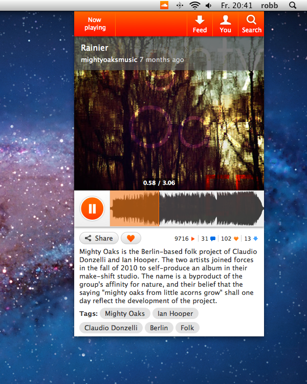
With that, you can turn SoundCloud mobile into a small icon on the top of your Mac's screen, that gives you easy access to the app, wherever you are.

Tip: Make sure you hide the status bar from the main menu before you pin the app to the status bar, you can still resize the app by dragging the corners, even though there are no handles visible.
I'll keep experimenting with Fluid, as I'm curious how Google+ and other mobile sites will work out.
Posted in thinking-about