How to build awesome CSS Envelopes
Even though I am an iOS Engineer by trade, I also have a passion for front-end developement. When I came across this shot on dribbble the other day, I started to wonder if I could create an awesome looking envelope with nothing but HTML and CSS and the awesome Symbolset Social font.
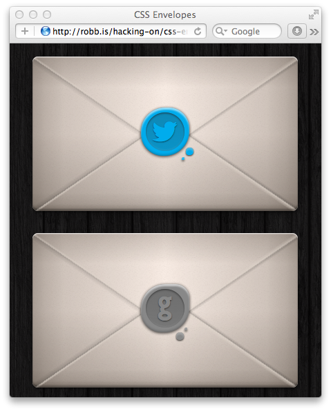
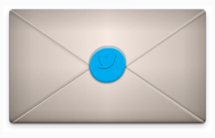
This is what I came up with:
So, let's have a look at the code, shall we?
First things first – the HTML
<a class="envelope" href="https://twitter.com/dlx">
  <span class="seal twitter ss-social-regular">
    <span class="embossed">twitter</span>
  </span>
</a>
The envelopes are simple <a>-tags. That's semantically appropriate and makes
the whole envelope clickable without any nasty tricks.
We use the outer <span> to model the seal on the envelope. The inner <span>
represents the embossed area of the seal.
As you can probably already tell, the real magic happens in the CSS!
A pretty clever font
@font-face {
  font-family: "SSSocial";
  src: url('./ss-social-regular.eot');
  src: url('./ss-social-regular.eot?#iefix') format('embedded-opentype'),
       url('./ss-social-regular.woff') format('woff'),
       url('./ss-social-regular.ttf') format('truetype'),
       url('./ss-social-regular.svg#SSSocialRegular') format('svg');
  font-weight: normal;
  font-style: normal;
}
First, we define the custom Symbolset Social font. It aliases the names of certain social networks and replaces them with their respective logos, for example 'twitter', when set in SSSocial, turns into a little bird: .
It's the same font I use here on my site and I urge you to check it out.
The .ss-social-regular class is just used to enable the Symbolset Social font
on specific tags, we only use them in the inner <span>s, no big deal.
.ss-social-regular {
  font-family: "SSSocial";
  font-style: normal;
  font-weight: normal;
  text-decoration: none;
  text-rendering: optimizeLegibility;
  white-space: nowrap;
  -webkit-font-feature-settings: "liga", "dlig";
  -moz-font-feature-settings: "liga=1, dlig=1";
  -moz-font-feature-settings: "liga", "dlig";
  -ms-font-feature-settings: "liga", "dlig";
  -o-font-feature-settings: "liga", "dlig";
  font-feature-settings: "liga", "dlig";
}
The envelope
Now, let's have a look at the .envelope class
.envelope {
  display: block;
  width:   24rem;
  height:  14rem;

  position: relative;
So far, this is all pretty basic, we turn the <a> into a block element and set
its dimensions. As we later want to position the seal absolutely within in the
envelope, we need to set the envelope's position attribute to relative.
To style the envelope, we first define a background color.
background-color: #F5E6DD;
This is where it gets tricky: we set no less than seven background images on the envelope to draw its paper texture and the two flaps.
Background images are defined top-to-bottom, here are the first two:
  background-image: -webkit-linear-gradient(235.5deg,
                                            rgba(  0,   0,   0, 0.0) 0%,
                                            rgba(  0,   0,   0, 0.0) 48%,
                                            rgba(  0,   0,   0, 0.1) 49%,
                                            rgba(225, 215, 205, 0.7) 50%,
                                            rgba(225, 215, 205, 0.0) 52%,
                                            rgba(225, 215, 205, 0.0) 100%),
                    -webkit-linear-gradient(-235.5deg,
                                            rgba(225, 215, 205, 0.0) 0%,
                                            rgba(225, 215, 205, 0.0) 48%,
                                            rgba(225, 215, 205, 0.7) 49%,
                                            rgba(  0,   0,   0, 0.1) 50%,
                                            rgba(  0,   0,   0, 0.0) 52%,
                                            rgba(  0,   0,   0, 0.0) 100%),
These first two linear gradients make up the bottom flap of the envelope. You see the gradient is mostly transparent, only a thin strip around the 50% mark is used to draw the actual flap. I've settled on the 235.5 degrees of rotation after experimenting a bit with it.
The next two gradients look similar.
                    -webkit-linear-gradient(-235.5deg,
                                            rgba(  0,   0,   0, 0.0) 0%,
                                            rgba(  0,   0,   0, 0.0) 48%,
                                            rgba(  0,   0,   0, 0.1) 49%,
                                            rgba(225, 215, 205, 0.5) 50%,
                                            rgba(225, 215, 205, 0.0) 52%,
                                            rgba(225, 215, 205, 0.0) 100%),
                    -webkit-linear-gradient(235.5deg,
                                            rgba(225, 215, 205, 0.0) 0%,
                                            rgba(225, 215, 205, 0.0) 48%,
                                            rgba(225, 215, 205, 0.5) 49%,
                                            rgba(  0,   0,   0, 0.1) 50%,
                                            rgba(  0,   0,   0, 0.0) 52%,
                                            rgba(  0,   0,   0, 0.0) 100%),
Notice that I reversed their colors as this they draw the top flap.
This is what the envelope looks like, so far:
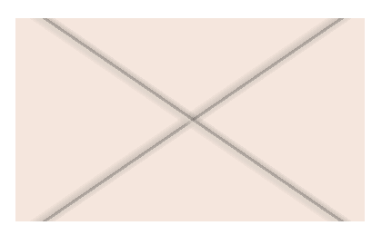
You'll notice that the four gradients overlap each other, forming two lines instead of four. We'll fix that in a bit.
We want our envelope to have a more realistic appearance, so we apply a vertical and a horizontal gradient to add some shading.
                    -webkit-linear-gradient(left,
                                            rgba(51, 41, 31, 0.4) 0%,
                                            rgba(51, 41, 31, 0.3) 5%,
                                            rgba(51, 41, 31, 0.2) 12%,
                                            rgba(51, 41, 31, 0.0) 50%,
                                            rgba(51, 41, 31, 0.2) 88%,
                                            rgba(51, 41, 31, 0.3) 95%,
                                            rgba(51, 41, 31, 0.4) 100%),
                    -webkit-linear-gradient(top,
                                            rgba(51, 41, 31, 0.20) 0%,
                                            rgba(51, 41, 31, 0.00) 20%,
                                            rgba(51, 41, 31, 0.00) 50%,
                                            rgba(51, 41, 31, 0.20) 88%,
                                            rgba(51, 41, 31, 0.30) 95%,
                                            rgba(51, 41, 31, 0.50) 100%),
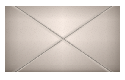
To top it off, I encoded a noise texture as a data-url to embed it straight into my stylesheet. (Some may consider this cheating, I couldn't care less…)
url('data:image/png;base64,iVBORw0KGgoAAAANSUhEUgAAAC8AAAA1CAYAAADRarJRAAAD8GlDQ1BJQ0MgUHJvZmlsZQAAOMuNVd1v21QUP4lvXKQWP6Cxjg4Vi69VU1u5GxqtxgZJk6XpQhq5zdgqpMl1bhpT1za2021Vn/YCbwz4A4CyBx6QeEIaDMT2su0BtElTQRXVJKQ9dNpAaJP2gqpwrq9Tu13GuJGvfznndz7v0TVAx1ea45hJGWDe8l01n5GPn5iWO1YhCc9BJ/RAp6Z7TrpcLgIuxoVH1sNfIcHeNwfa6/9zdVappwMknkJsVz19HvFpgJSpO64PIN5G+fAp30Hc8TziHS4miFhheJbjLMMzHB8POFPqKGKWi6TXtSriJcT9MzH5bAzzHIK1I08t6hq6zHpRdu2aYdJYuk9Q/881bzZa8Xrx6fLmJo/iu4/VXnfH1BB/rmu5ScQvI77m+BkmfxXxvcZcJY14L0DymZp7pML5yTcW61PvIN6JuGr4halQvmjNlCa4bXJ5zj6qhpxrujeKPYMXEd+q00KR5yNAlWZzrF+Ie+uNsdC/MO4tTOZafhbroyXuR3Df08bLiHsQf+ja6gTPWVimZl7l/oUrjl8OcxDWLbNU5D6JRL2gxkDu16fGuC054OMhclsyXTOOFEL+kmMGs4i5kfNuQ62EnBuam8tzP+Q+tSqhz9SuqpZlvR1EfBiOJTSgYMMM7jpYsAEyqJCHDL4dcFFTAwNMlFDUUpQYiadhDmXteeWAw3HEmA2s15k1RmnP4RHuhBybdBOF7MfnICmSQ2SYjIBM3iRvkcMki9IRcnDTthyLz2Ld2fTzPjTQK+Mdg8y5nkZfFO+se9LQr3/09xZr+5GcaSufeAfAww60mAPx+q8u/bAr8rFCLrx7s+vqEkw8qb+p26n11Aruq6m1iJH6PbWGv1VIY25mkNE8PkaQhxfLIF7DZXx80HD/A3l2jLclYs061xNpWCfoB6WHJTjbH0mV35Q/lRXlC+W8cndbl9t2SfhU+Fb4UfhO+F74GWThknBZ+Em4InwjXIyd1ePnY/Psg3pb1TJNu15TMKWMtFt6ScpKL0ivSMXIn9QtDUlj0h7U7N48t3i8eC0GnMC91dX2sTivgloDTgUVeEGHLTizbf5Da9JLhkhh29QOs1luMcScmBXTIIt7xRFxSBxnuJWfuAd1I7jntkyd/pgKaIwVr3MgmDo2q8x6IdB5QH162mcX7ajtnHGN2bov71OU1+U0fqqoXLD0wX5ZM005UHmySz3qLtDqILDvIL+iH6jB9y2x83ok898GOPQX3lk3Itl0A+BrD6D7tUjWh3fis58BXDigN9yF8M5PJH4B8Gr79/F/XRm8m241mw/wvur4BGDj42bzn+Vmc+NL9L8GcMn8F1kAcXi1s/XUAAAACXBIWXMAAAsTAAALEwEAmpwYAAABbmlUWHRYTUw6Y29tLmFkb2JlLnhtcAAAAAAAPHg6eG1wbWV0YSB4bWxuczp4PSJhZG9iZTpuczptZXRhLyIgeDp4bXB0az0iWE1QIENvcmUgNC40LjAiPgogICA8cmRmOlJERiB4bWxuczpyZGY9Imh0dHA6Ly93d3cudzMub3JnLzE5OTkvMDIvMjItcmRmLXN5bnRheC1ucyMiPgogICAgICA8cmRmOkRlc2NyaXB0aW9uIHJkZjphYm91dD0iIgogICAgICAgICAgICB4bWxuczpkYz0iaHR0cDovL3B1cmwub3JnL2RjL2VsZW1lbnRzLzEuMS8iPgogICAgICAgICA8ZGM6c3ViamVjdD4KICAgICAgICAgICAgPHJkZjpCYWcvPgogICAgICAgICA8L2RjOnN1YmplY3Q+CiAgICAgIDwvcmRmOkRlc2NyaXB0aW9uPgogICA8L3JkZjpSREY+CjwveDp4bXBtZXRhPgrlPw1BAAAFcUlEQVRo3o2auU5rQRBE+yv4CYfv/yMSEhISEhIShISQkBABJDzaUqHjonrmBle2587Sa/Uyru/v76uf5/Tz/Ovn7e3t/Pn09PTv4+Pjd+zr6+v8XWP6TM/t7e3ve1+nvTm/3/UZ/cl1Wvvy8uJnnJ6fn6/q8/PzxJf9/QiBZJSPDuTz+Ph4QfRqDt81LTojrDkVuU8Ea1MSqo36nSR2fX19Jo6H9DsKRtLs+ZqXGOG4C0j79Xj5oknaPu5EuTZcYpyz02jvPTElYfZTlAK5lNT66QU8kGt2jGpea0UHp/du186AtMr9arLVZM+Tw+0eNyd31JUv8bvvUyT84eHhgrAep/r5TuNJisk0JufuM309LSH5WiS+D7y/v99K0gkTk3T6leaoPcIj93A7l1nxfYlzctVjrrokSSew14l52md/Bqz+M296uF6COdv8TkKEpoQcfvCEJJMAEjwyUHENY9BZ8rLlCXcTMcRrjtEEfO0ErQ4A/o5oJAH0/P5dyQlXaDNt7mtIrEtdpsr5/Z5aPoKCtbPJlbNOwUR7MRJrTITrt8MufYBnUQA6t/zAPshNIhGmxI0RzyW0c8QkFEk27evwXJOzrDYWEx40pPq7u7vorIkZ2e/ElJiQUKmtohN4RkeC3EScEEqq57Z5KLWYAhjPSLFjlTCeHdadKCVYLhkxm/A+zdWYC2ACBWnJCdbvX8n3JKlZWkj4O220s2GCgWecFIzDrjC9v7f2mBxKm5XUrsU0qaGi+YMIKyZ2ObtXbA6ZYkjzakKEVATQNqeEzE0lBSMSSN9Ids/g5yZ8UYy0+bB2naJrYrCJUGXlEtehU/DZaYVmTYZKnJOjnT1PeQlzDxE91ase7OjUq8BJky73Ytoac3lWVsrqkh+IWKbW8icX0JQCC8GS9i6CVFLzFCyStLWp1wE+t9+v0l/GkxQ/kj+U8o6UAMmhqI2pnEsRlD0gotcRnPe407//VFJuMqk+naTlBxzJ4903aEJKOY7GlPJOV2oSqTx0IlJhzci7iqoT1LJuduZjDTvh8yroeDrgxQZNhoVOqgfkoJ4HMSARJi9yG3oybdvVm7JMHn4kRZjQ6cjjWiw/mI6RJJWwd8JjaVJOz/2nDoRHV5quzylxs8r4KN2U2srRHUm8YTRJlI7vaciUGJ6DlKs7Fc2MeqnH4sU7JZYg1osbMsaiI+X6EnLPq1VLbupc+fubm5uxHuWYDp4qKu/YJXunIEtcNHdevrnNybHZIfPDJgLShcKqyeQFfNJUkaBdb9x7l17O0R7ppEfa5EceN8Fz3yYlYm5GCXXEwK7TmyLuLp6w2Pb+zkXHzHvkmixb3uUYq87DCjEmje7iyp8I632Syak88gkNkgaYt/u9V+rQeZfa8yIvaCpleVSZw1qKCZPtTg2klH1yjPN5Pok/pwdcyAIjNU130fVI6y+hWWpeHUGh2i2iY2ohCwRJZJWnH2mT0Ly8Ykoo9ZuYHbljorn4/NR7WaHN6vJAhUtK+Nz+a5e5Mf/mRqxLp7gwOXyCS7YGadfSSjLZcg+ewvzqzmjXknbTcCa8+CGqub9wbU2ZoOcgDWFEn1WqnGz+iB9M1zxTv6cmQojjRwoGRyxK1pErtTUSmvjZvq52F1q0v5Si8jbRtZUuCFYXbh6JmRp4Vdbn1urmYZWY7eDPr9o9K0x1Q1pD4fjfWSpdEaYqitc+iYCk9iMtlNUYb+YToNQULI6o2m9DdsXz6ndiYndPW9Otg2/i5dkU2FKnoIucqW03RVzfX8GLAFCvr68nZofsWvEmYvKDVUc3EaRWnv7C4kTuYFbnNN31/v5+JQYmk/C7IuX5freazGxq36WCR0T6fuk/Zj/P1X8GU07lyzj+XAAAAABJRU5ErkJggg==');
Our envelope looks a lot better now:
Next up: positioning the backgrounds.
It took me a while until I found good positions for the flaps, but I found these values to work fine.
  background-position: 105% 215%,
                        -5% 215%,
                       100% -80%,
                         0% -80%,
                       center,
                       center,
                       center;

  background-size: 12rem 12rem,
                   12rem 12rem,
                   12rem 12rem,
                   12rem 12rem,
                   auto,
                   auto,
                   auto;

  background-repeat: no-repeat,
                     no-repeat,
                     no-repeat,
                     no-repeat,
                     repeat,
                     repeat,
                     repeat;
You'll notice that I set background-position, background-size and
background-repeat for the first four backgrounds (the flap-gradients) and then
restore the default values for the other three.
Last but not least, we add some more subtle shadows, both inner and outer and turn up the border radius to avoid nasty paper cuts.
  box-shadow: 0  1px  0   rgba(255, 255, 255, 0.6) inset,
              0  2px  0   rgba(255, 255, 255, 0.2) inset,
              0 -3px  3px rgba(  0,   0,   0, 0.3) inset,
              0  2px  3px rgba(  0,   0,   0, 0.4),
              0  6px 12px rgba(  0,   0,   0, 0.2);

  border-radius: 0.5rem;

  text-decoration: none;
}
Now our envelope actually looks pretty nice.
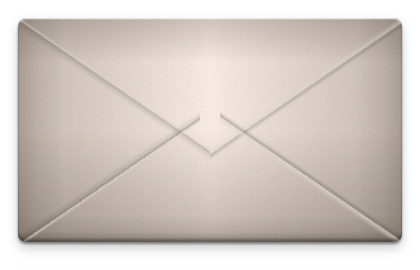
Now, the flaps may look a bit odd, but we'll just cover that up with the seal and keep that between the two of us, okay?
The seal
The seal itself is actually pretty straight forward. First, we position it in the roughly in center of the envelope.
.seal {
  display: block;
  width:   4.4rem;
  height:  4.4rem;

  position: absolute;
  left:     50%;
  top:      49%;
  margin:   -2.2rem 0 0 -2.2rem;
Easy! Now we set the border-radius property, wax seals are not square after
all.
border-radius: 2.2rem 1.9rem 2.3rem 2.0rem;
I defined four different radii to create the illusion of molten wax that you wouldn't get with a perfect circle.
Let's add a dash of color and some more highlights…
  background:   #00ACED;
  color:        #00ACED;
  border-color: #00ACED;

  box-shadow: 0 -2px 4px rgba(  0,   0,   0, 0.2) inset,
              0  3px 3px rgba(255, 255, 255, 0.6) inset,
              0  1px 5px rgba(  0,   0,   0, 0.8);

  text-align: center;
  line-height: 4.2rem;
  font-size:   2.2rem;

  text-shadow: 0 1px 2px rgba(0, 0, 0, 0.6);
}
and we're almost there.
Remember the .embossed class from the beginning? Now it's time to style it!
First the position,
.seal .embossed {
      display: block;
      width:   80%;
      height:  80%;

      position: absolute;
      top:      10%;
      left:     10%;
      /* ... */
then we add some shadows to achieve the desired embossed effect…
      box-shadow: 0  -2px 2px rgba(205, 205, 205, 0.1) inset,
                  0   3px 3px rgba( 30,  30,  30, 0.1) inset,
                  0   1px 2px rgba( 30,  30,  30, 0.6) inset;

      border-radius: 999rem;
and finally, the background gradient. I chose a semi-transparent grey that I laid over the background of the seal. This makes customization easier as I only need to re-color the seal if I want a different kind of wax.
      background-image: -webkit-linear-gradient(top,
                                                rgba( 51, 51, 51, 0.3) 0%,
                                                rgba( 51, 51, 51, 0.2) 100%);
    }
Now we're pretty much finished:

But, where's the drop?!
As a small bonus, let's add two wax drops next to the seal to make it look even more awesome.
We're going to use the :before and :after pseudo-selectors to avoid adding
more tags to our markup. This first piece of code defines the common attributes
of both drops:
.seal:before, .seal:after {
  display: block;
  content: ' ';
  position: absolute;

  line-height: 0;
  font-size:   0;

  background: inherit;
  overflow:   hidden;

  box-shadow: 0 1px 3px rgba(  0,   0,   0, 0.8),
              0 3px 3px rgba(205, 205, 205, 0.4) inset;
}
I set the background property to inherit so that the drops will end up
having the same color as the seal.
We want both drops to look different so we set different values for width,
height etc.
.seal:after {
  width:   0.7rem;
  height:  0.7rem;
  top:      84%;
  left:     94%;

  border-radius: 1rem 0.9rem 0.95rem 0.8rem;
}

.seal:before {
  width:   0.3rem;
  height:  0.3rem;
  top:      103%;
  left:     85%;

  border-radius: 1rem 0.9rem 0.95rem 0.8rem;
}
And here is the final result:

I hope you enjoyed this small tutorial, if you have any feedback, feel free to send me a tweet @dlx or an e-mail.
You can also flattr this, if you fancy.
Posted in working-on